The SMCS Board of Governors has approved a new graphic insignia to express the Society’s traits and values.
Organizations express their personality by what they do and how they present themselves. A visual identity typically includes a graphic element that is easily recognized and understood. This can be an image (insignia), type (logotype), or combination of the two that expresses the organization’s character. Before 2014, the Society used its full name as its identity:


Over a decade ago, the Society considered replacing that identity with one that was more distinctive. SMCS held a contest among Society members that ultimately yielded no winning selection. Dr. Bill Gruver, then-Chair of the Electronic Communications Subcommittee, suggested finding a professional company or individual designer instead. That effort was later put on hold at a time when the Society was considering a name change. After the name change consideration concluded, the pursuit of a new identity remained an open issue until several years later. In 2014, Bill led another effort to create a visual identity, this time as part of developing the Society’s new web site. During those deliberations, two aspects were considered to be unique, key differentiating factors that needed to be evident in the solution.
- The “man” aspect of SMCS
- The three technical areas
A consistent visual character across all visual media can reinforce platform traits such as human-centered and interdisciplinary science. D2 Creative (the company contracted to design and maintain the Society web site) generated ideas based on discussion with Bill Gruver’s committee using an abstract human form to infer “man” and a code pattern to represent orderly interaction and control. The result was distinct from any other IEEE Society visual identity. The committee chose the following versions to recommend to the BoG:
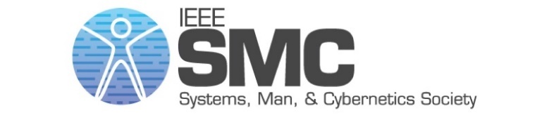
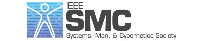
Even though there was lively discussion, the ExCom did not reach a final decision. As a result, the Society chose to use just the logotype comprised of its initials, which the Society used from 2015 to 2019:
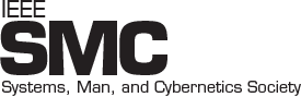
While the logotype did reflect the Society’s relationship with the IEEE, it did not convey the Society’s human-centered, interdisciplinary science traits that had been identified in its 2018 platform the Promotion and Branding Committee had developed. A new visual identity would present SMCS with an opportunity to be better understood by groups with which it seeks to build strong relationships. It would also replace multiple representations created and used by members and partners instead of an official SMCS insignia.
The Promotion and Branding Committee platform had spelled out essential requirements for a new visual identity:
- Distinctive—Different from other organizations within and outside of IEEE
- Recognizable—Able to be understood across cultures
- Human—Clearly convey the SMC Society’s differentiating “human” aspect
- Interdisciplinary—Indicate traits from all three technical areas
- Practical—Suited to reproduction in various media, at various scales
The Committee offered a series of steps to move forward on “Project Gruver” on this suggested schedule:
| May: |
Review prior art with ExCom Propose requirements to ExCom |
| Jun: |
ExCom review/edit/approve requirements, and provide guidance for new approach Convene committee to develop design treatments |
| Jul: |
Review design treatments with President Develop finished version(s) based on President guidance |
| Aug: |
President socialize finished version(s) with ExCom Present to ExCom to endorse two versions for BoG vote |
| Oct: |
Present to BoG for approval vote Upon approval, implement across collateral, electronic media |
By the end of 2019, the Board of Governors adopted the new insignia and previous logotype as the Society’s new identity.
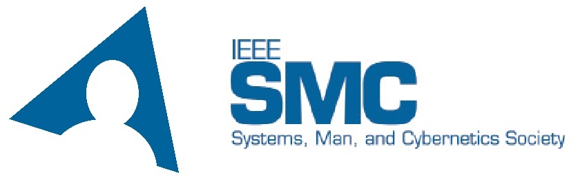
The new identity addresses all of the Society’s requirements. It is different from other organizations within and outside of IEEE, and can be understood across cultures. Its inclusion of a human form clearly conveys the SMC Society’s differentiating “human” aspect. Its triangular shape indicates integration of all three technical areas of interest into a unified whole, and its simplicity makes it suitable for reproduction in various hard copy and electronic media, at various scales.
Look for the new identity on the SMCS web site, brochure, and other locations where we share who we are among friends, members, and colleagues.
